
Begin with three jobs for your colors
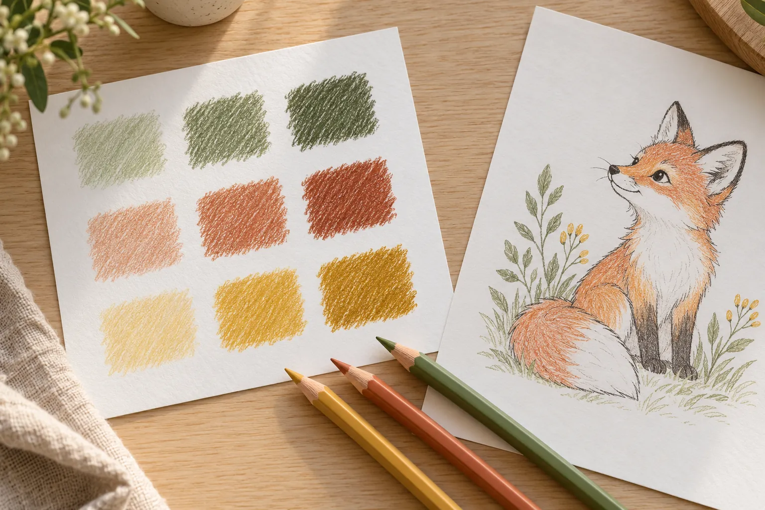
A small palette makes it easier to start when a box of pencils offers too many choices. Give each color a job: one main color for the largest subject, one supporting color for nearby shapes and one accent for small details. The jobs matter more than finding a supposedly perfect combination. On the woodland fox, warm orange can lead, a muted green can support the leaves and a golden yellow can mark a few small details.
Place those three pencils beside your page and move the rest aside for the first few minutes. You can add another color later if a shape needs it. Keeping the initial choice small lets you notice how often each color appears and whether one area is competing with the character. White paper can be part of the plan too, especially around a busy scene.
Make swatches on the paper you will use
Draw three small patches on spare paper from the same pack as your print. Use the pressure you expect to use on the page. A pencil barrel or a screen preview can give a misleading impression of the mark, particularly for pale colors. Put the patches beside each other, then repeat one with lighter pressure. Check whether the main and supporting colors are easy to tell apart when they touch.
Try a second set if the first feels too similar: orange, sage and golden yellow for a woodland picture; blue, teal and coral for an underwater scene; or lavender, mint and peach for a playful character. These are starting choices rather than fixed formulas. Write the pencil names or numbers beside the swatches if they have them, so you can return to the same combination without searching.
Plan where the accent will repeat
Before filling a large area, point to two or three places for the accent. On the sea turtle page, blue and teal can cover the water and shell while coral repeats in a few surrounding details. Keeping the accent in smaller areas helps it stand out. If you give every shape a different bright shade, the word “accent” no longer describes a useful role; you have chosen a varied palette instead, which is a different effect.
A tiny planning sketch on spare paper can help. You do not need to color an entire miniature copy: three loose shapes marked with the chosen shades are enough. Ask which shape should catch your eye first. If the accent distracts from that shape, reduce its area or use a softer pressure. Let the picture guide the decision.
Create variation with pressure and layering
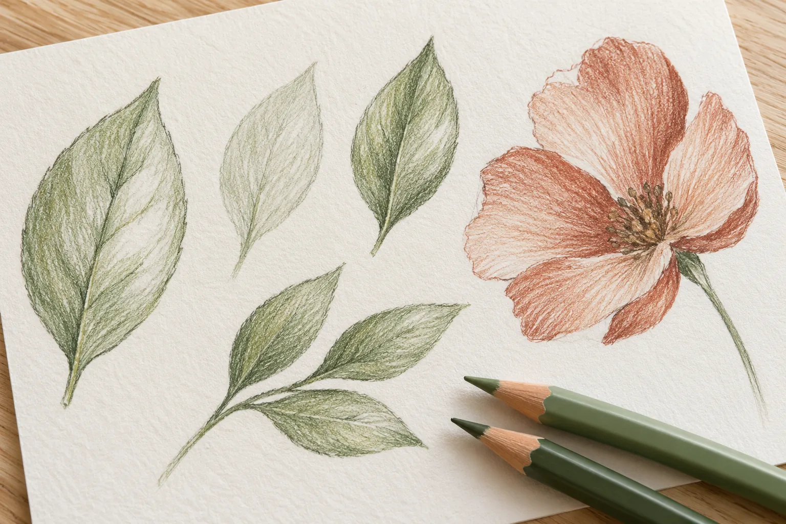
Three pencils can produce more than three appearances. Try a light layer inside a shape, then use the same pencil more firmly near one edge. Leave a narrow patch of paper untouched as a highlight if you like the effect. Test on scrap paper first, because heavy pressure can make later layers harder to add and different pencils behave differently. Build slowly rather than trying to achieve the darkest mark in one pass.
On the sunflower page, yellow petals can vary through pressure while a warm brown center provides contrast. A small orange layer near the base of selected petals may add warmth without turning every petal into a different color. This is an experiment, not a requirement to shade the page realistically. Flat color remains a complete choice, especially when you want clear, graphic shapes.
Adjust the palette when the scene changes
A collection of fruit creates a different question from a single animal. On the fruit basket page, begin with a few recognizable fruit colors, then repeat one leaf green and one basket brown so the scene has common elements. The aim is to reduce unnecessary decisions while leaving useful differences. You can reserve one bright color for the fruit you want to emphasize instead of trying to fit every object into the original three pencils.
For a fantasy scene, recognition may matter less than mood. A lavender dragon or a mint rocket can still read clearly if its outline is understandable. Look through the flower and nature collection for a second subject, and reuse the palette on it. Comparing the two pictures shows how shape and color area change the effect of the same pencils.
Keep a palette note you can actually reuse
After a session, save the little swatch strip with the finished or unfinished page. Add one short observation: “coral works best on small shapes,” “light blue needs firmer pressure” or “leave the background white.” That note is more useful next time than deciding whether the result was good or bad. If you want to change the palette, keep two colors and swap only the accent; the comparison will be easier to read.
For a shared table, each person can choose their own three-color set for the same picture. Put the results side by side and notice where the colors repeat without ranking them. You can also bring a favorite palette into a custom coloring-page idea by choosing a scene with one main character and a few large supporting shapes. The line drawing provides the spaces; your swatches make the color decisions yours.